
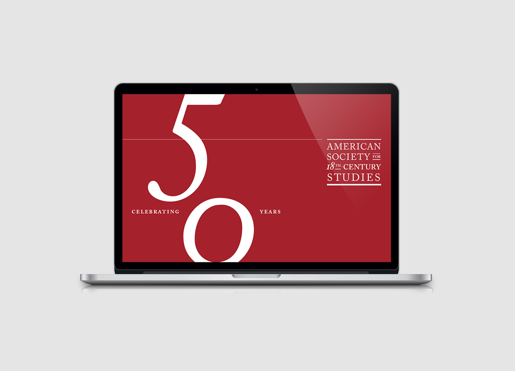
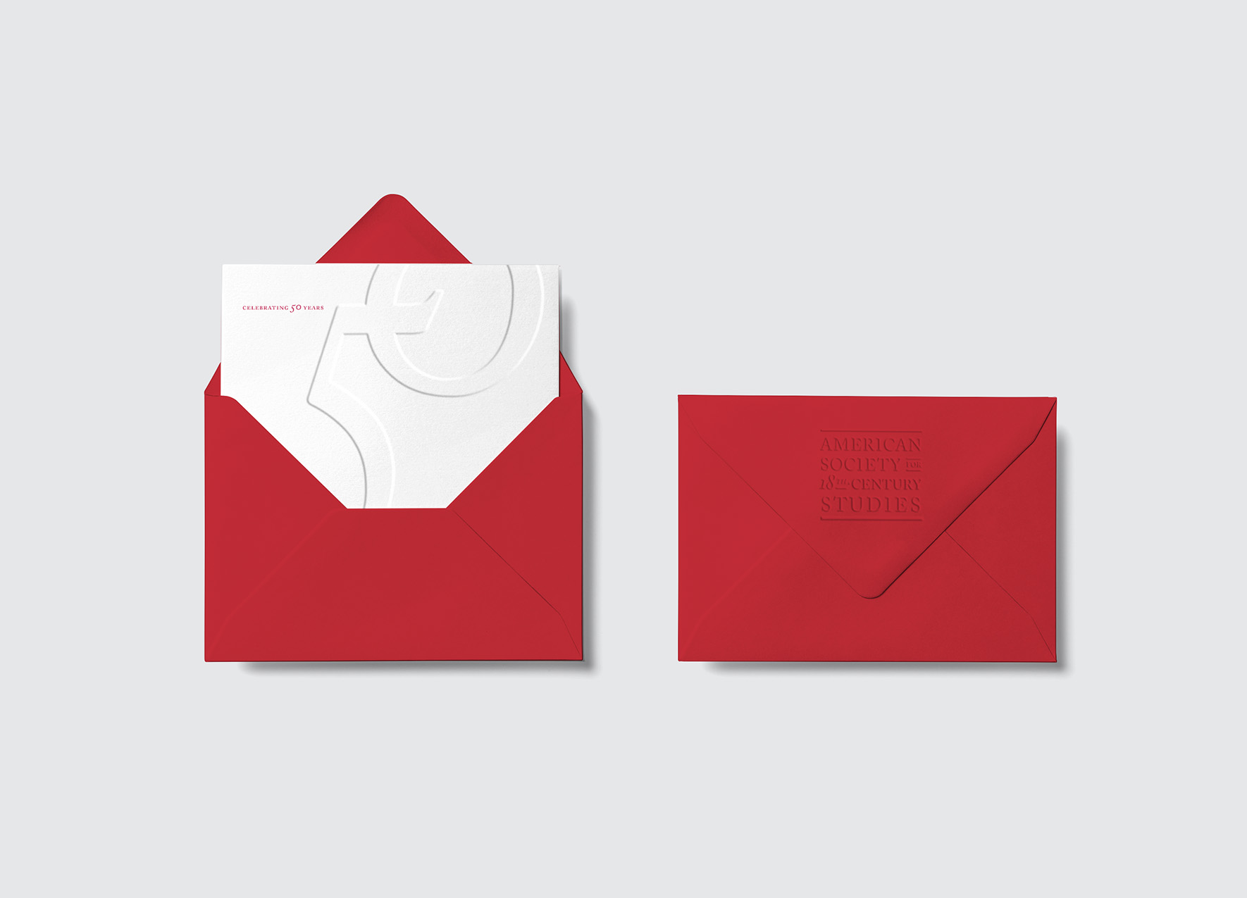
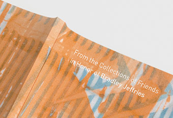
AMERICAN SOCIETY FOR 18TH-CENTURY STUDIES
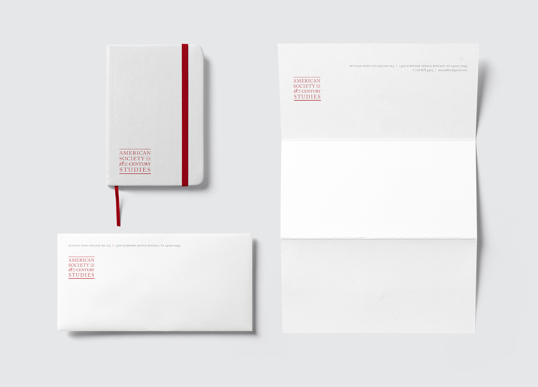
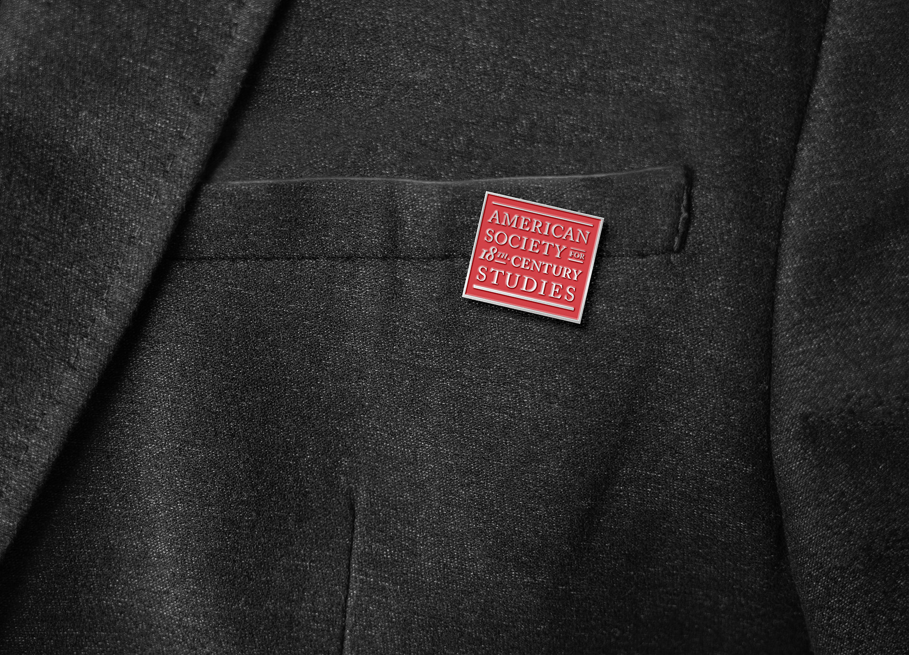
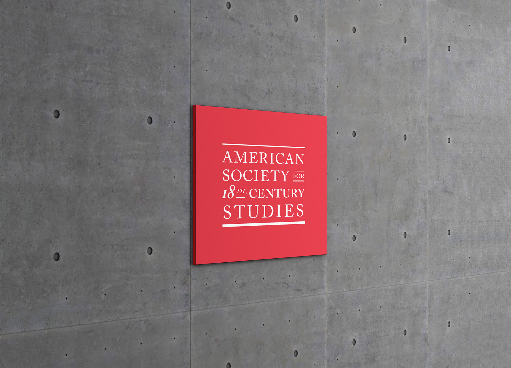
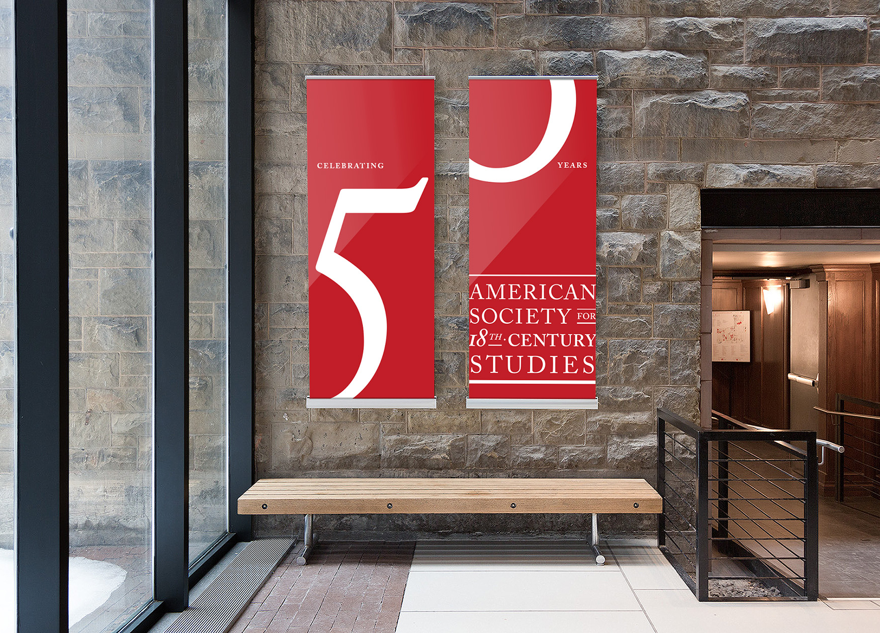
identity for an organization focused on american society in the eighteenth century, on the occasion of their 50th anniversary. the system is rooted in a version of the caslon typeface, originally designed by type designer william caslon in 1722. our solution was to create a clear, historically-appropriate typographic system with simple, elegant applications.
SELECTED WORKS

ART AT OHANABOOK DESIGN
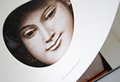
DINH Q. LÊ: THE JOURNEY IS RETURNProject type

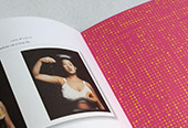
SF BALLET GALACollateral
THE HODGES EFFECTCampaign Design

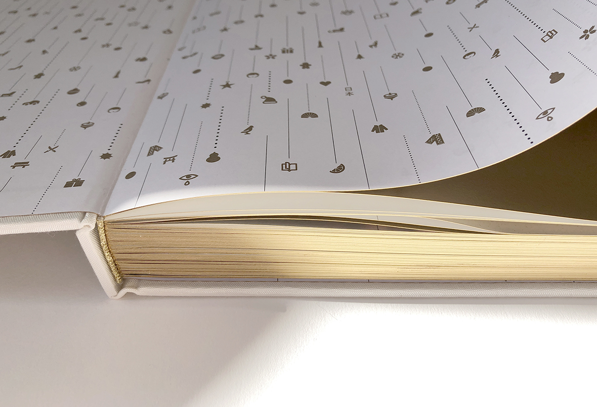
SNOWBALL AND MEbook design
INTERNAL LOGICBook Design
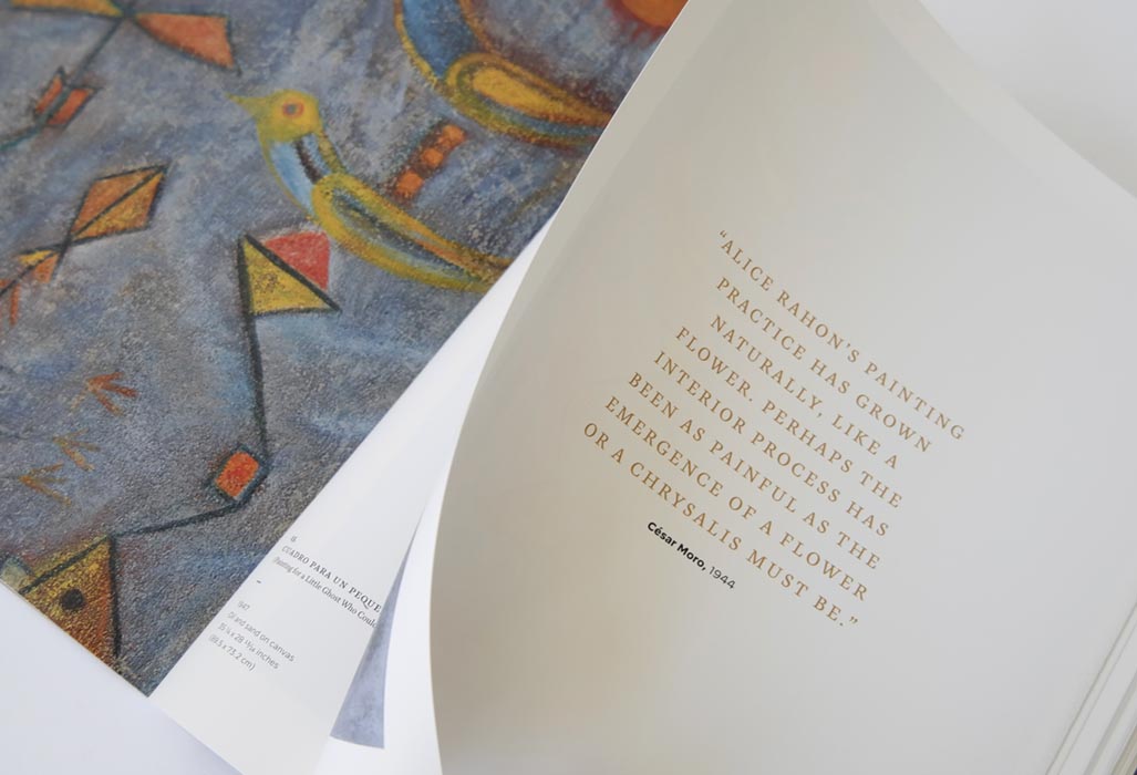
ALICE RAHONBOOK DESIGN
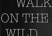
A WALK ON THE WILD SIDEBook Design
PEELING BACK THE SKYBook Design
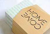
COME HOMEProject type

THE REST BETWEEN TWO NOTESBook Design

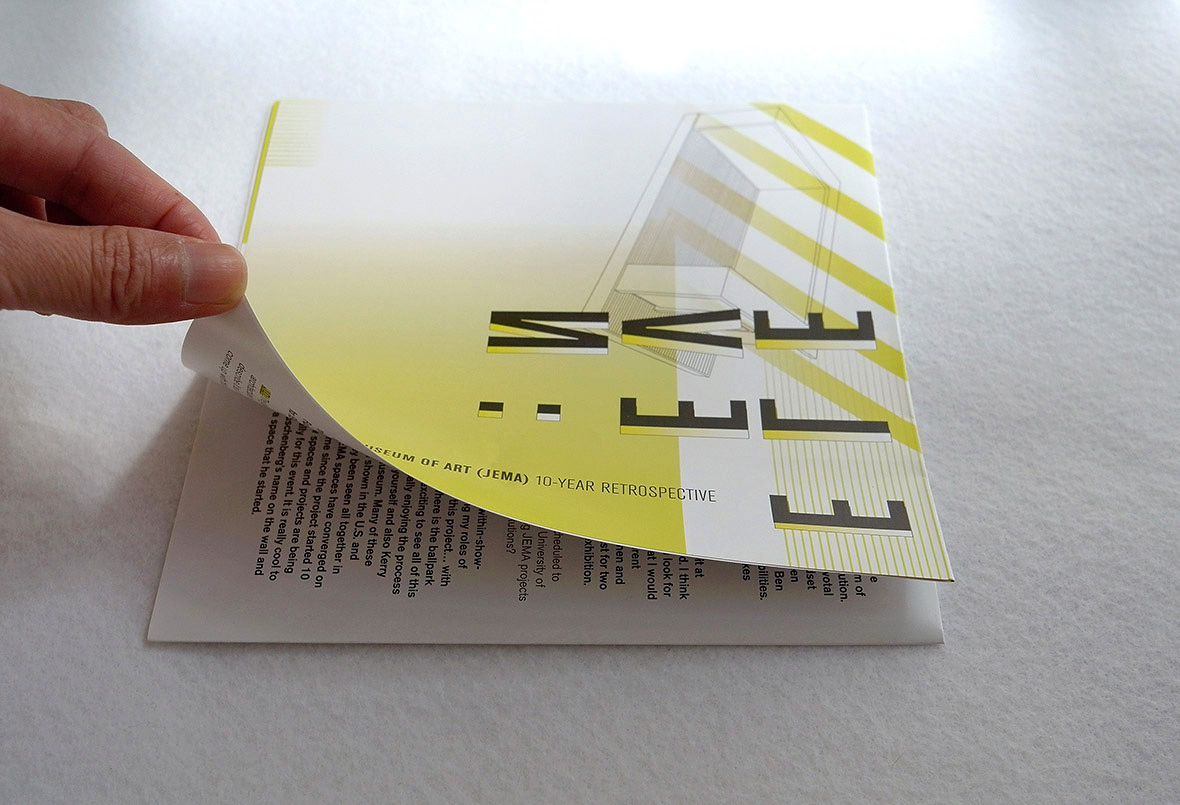
SAN JOSÉ MUSEUM OF ARTProject type

SJMA GALAProject type
ART MUSEUM DUSTProject type

A BOOK’S BOOKProject type
JOSEPH PHELPS VINEYARDS: THE BEST WE CAN BEProject type
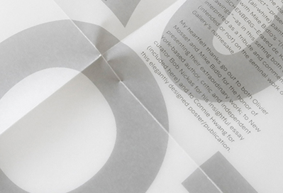
OLIVIER MOSSET & MIKE BIDLOPOSTER / BROCHURE DESIGN


MAGGIE TAYLOR: LEWIS CARROLL SERIESProject type
GARDEN OF THE HEART’S DESIREProject type
SEAN MILLERProject type

STAKING CLAIMProject type

SUBTROPICSProject type
OYSTER BOYBranding
TURNING GHOSTS INTO ANCESTORSBook Design

MAGGIE TAYLOR: NO ORDINARY DAYSProject type
GREATER THAN THE SUMProject type

ASIAN ART MUSEUM OF SAN FRANCISCOProject type
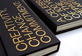
CREATIVITY, CHANGE, COMMITMENTProject type

THE TIME BETWEEN: THE SEQUENCES OF MINOR WHITEProject type

ARNOLD MESCHES: A LIFE’S WORKProject type
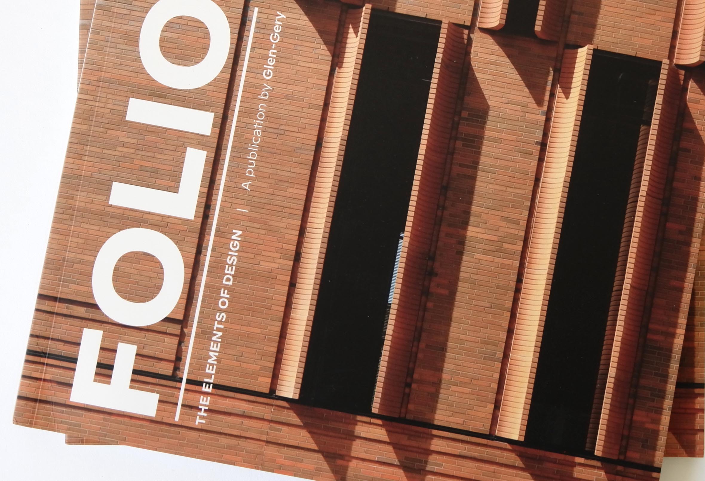
FOLIOBOOK DESIGN
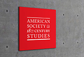
AMERICAN SOCIETY FOR 18TH-CENTURY STUDIESIDENTITY DESIGN

VAL BRITTON / REVERBERATIONSProject type

INFOSYS CONFLUENCEProject type
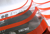
STREETWISE: MASTERS OF 60S PHOTOGRAPHYProject type
RAUSCHENBERG & ALBERS: BOX VS. SQUAREProject type
MARY LOVELACE O’NEAL: FROZEN IN TIMEBook Design

BETWEEN SILVER LIGHT AND ORANGE SHADOWProject type
RAUSCHENBERG: A GIFT IN YOUR POCKETBOOK DESIGN
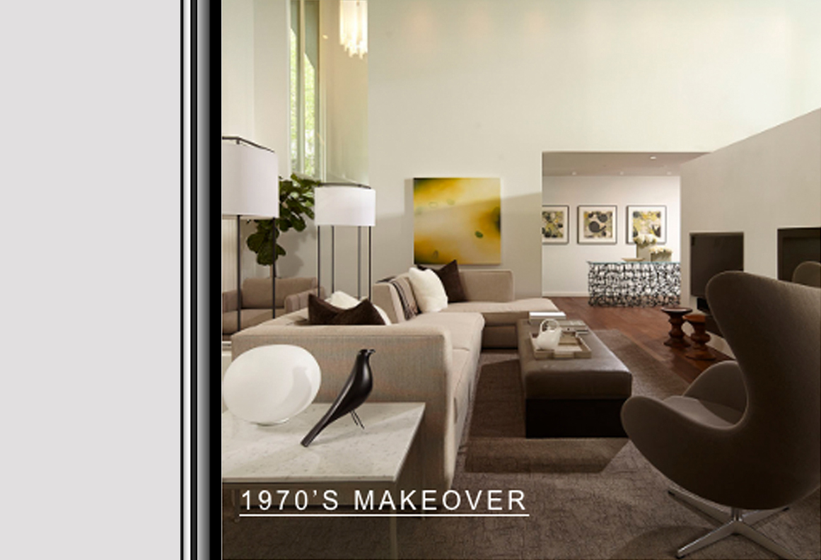
ANDREW FLESHER INTERIORSProject type
© all rights reserved. connie hwang design.